Purplebricks
Designing a clearer, unified appointment experience
Overview
The appointments feature was one of the most frequently used parts of the Purplebricks app, with 24,600 customers managing their appointments each month and over 70,000 monthly active users.
At the time, Purplebricks was undergoing a series of technical improvements, and in line with that, the app was being redesigned to enhance performance and improve the overall customer experience.
Scope
Research, design and testing
Team
Agile sprint team
Duration
12 weeks
Outcomes
- Increased the app store rating of the app from 3.7 to 3.9.
- Number of negative reviews about appointment decreased.
- Accepted viewing saw an increase of 3%
Objective
Improve and streamline managing appointments in the Purplebricks app. Bringing it in line with usability guidelines and common UI patterns.
Understanding what didn’t work about the appointment experience
I began by mapping the current end-to-end experience to identify where customers could interact with appointment information.
A few key issues emerged:
- Scattered entry points: Five different locations customers could interact with their appointments. This caused confusion and repeated journeys.
- Limited visibility: Buyers couldn’t view cancelled viewings on the app.
- Visual clutter: Inconsistent hierarchy and low contrast affected readability.
- Future bookings: The in-app calendar allowed bookings up to 49 days in advance the same as the average time a property stayed on the market. However, usage data showed that buyers typically scheduled viewings just a few days ahead, making the extended window unnecessary and adding complexity to the experience.
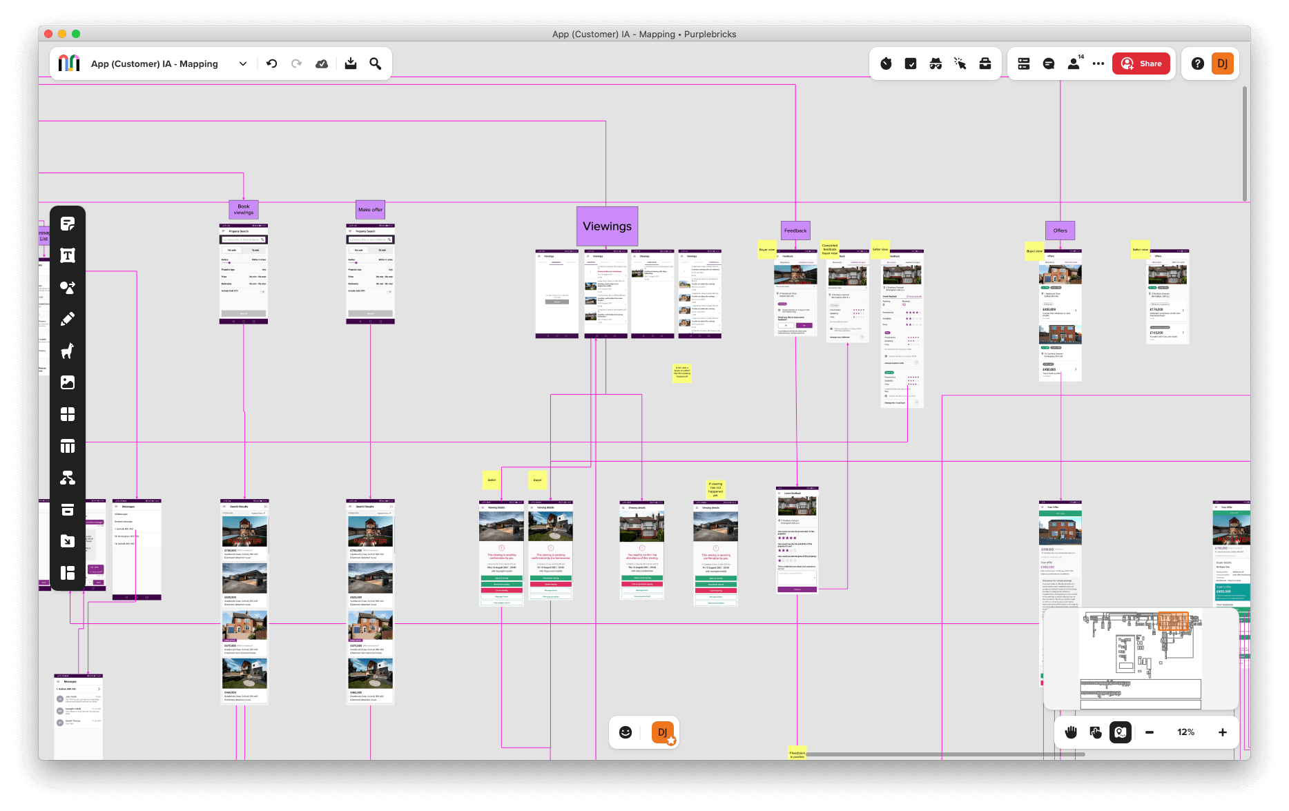
Mapping of the current app experience
Challenging my observations
To test and deepen my observations, I conducted a mix of qualitative and competitive research.
User testing the current experience
I quickly prototype a rough version of the app to test what I had observed in the mapping of the experience.
I tested on Userbrain with five participants surfaced consistent friction points:
- 3 of 5 found the main list difficult to scan.
- All participants wanted arranged (upcoming) viewings shown first.
- Several found the red status colour confusing — often associating it with errors.
- Actions like cancelling or rescheduling were buried low on the details page.
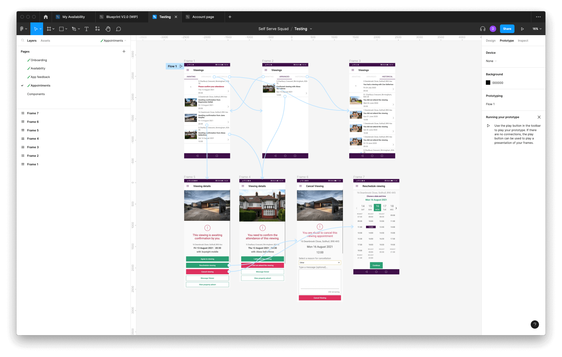
Prototype set up for unmoderated user testing
Reviewing competitors
I analysed direct and adjacent products (estate agents, property apps) to benchmark best practices.Patterns observed:
- Appointment lists were typically split between Upcoming and Past tabs.
- Competitors tend to used card-based layouts were used for clarity and scannability.
- Primary actions were consistently surfaced at the top of detail screens.
Reviewing customer feedback
I reviewed customer feedback referencing appointment booking and viewings to uncover themes.
Key Pain Points Identified:
- Limited visibility: Users wanted to view cancelled appointments, which was only possible on the website, not in the app.
- Unconfirmed requests: Both buyers and sellers expressed frustration with appointment requests that often went unanswered.
- Performance issues: Slow page load times negatively impacted the overall experience.
Finalising appointment flows
I worked with engineering and PM to review high-level task flows and agree on an incremental release plan. Given competing roadmap priorities, we decided to deliver in phases starting with the appointment list, followed by details, then cancellation and rescheduling.
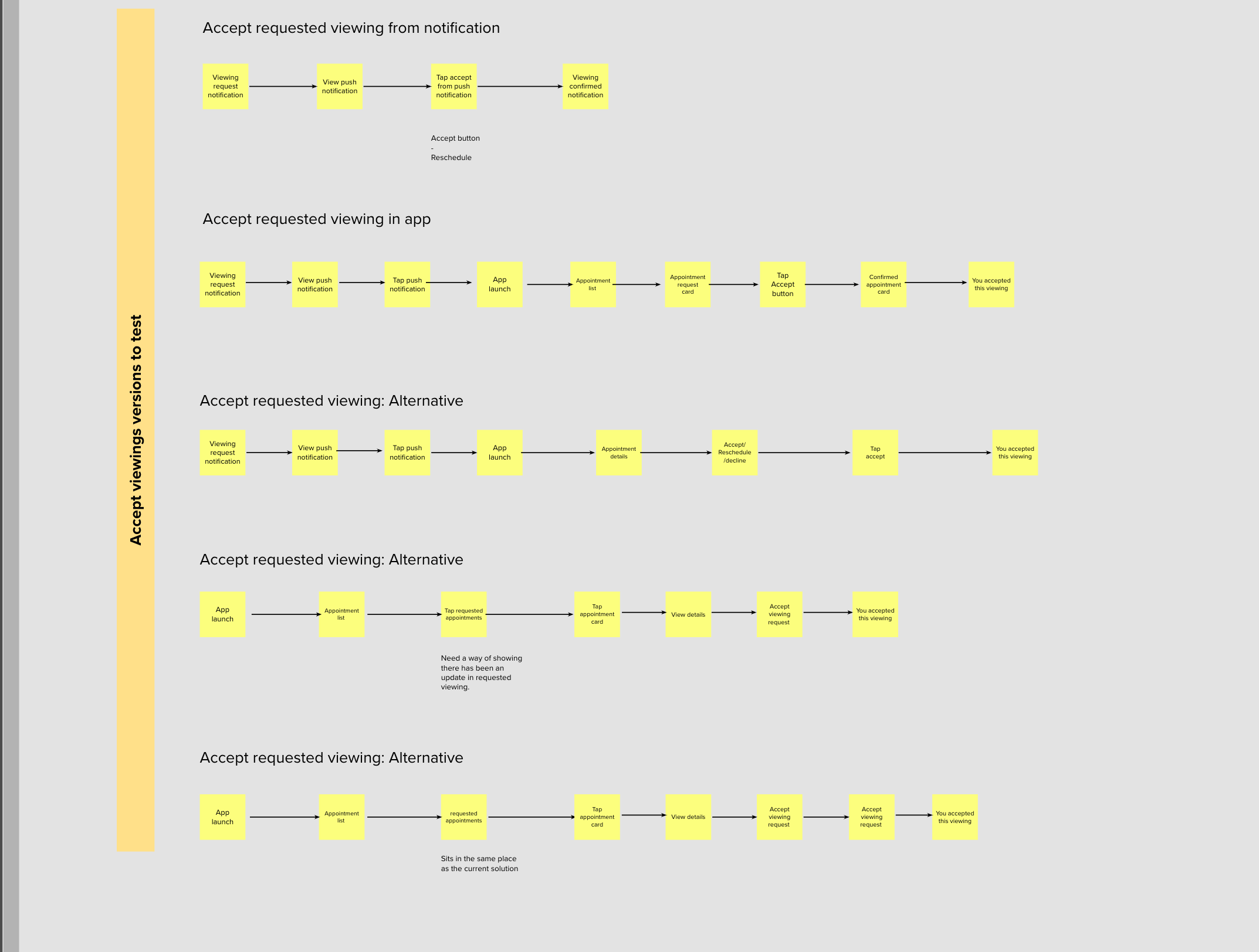
Flows to plan the new high level experience
User testing
I prototyped a solution and quickly moved the design into usability testing.Findings from testing:
- All participants found the new appointment experience easy to navigate.
- 4 out of 5 fed back they would like to see the appointment type in the list view.
- 4 out of 5 participants took a while to understand the pending tab
- All participants could accept and find all the information and details of their appointment.
- In the expectation test, users had difficulty understanding tab menu titles.
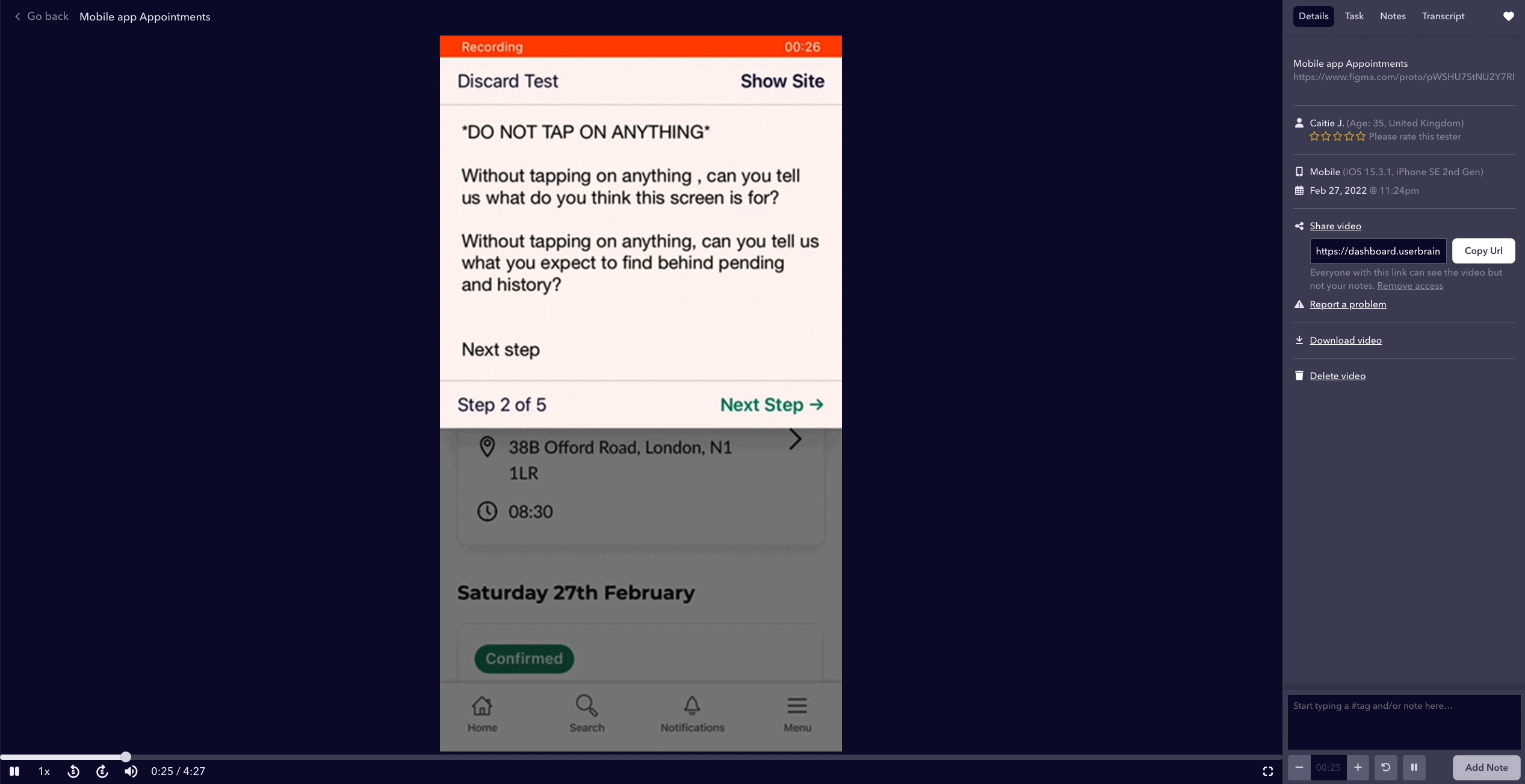
Unmoderated usertesting on userbrain
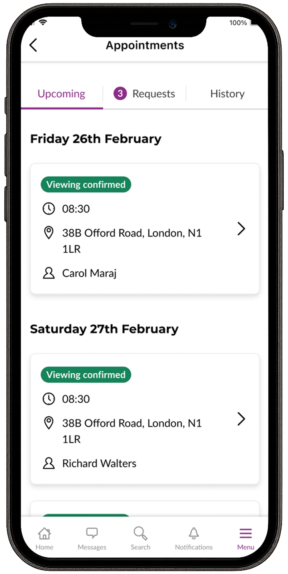
Unified list view
Using feedback and research we consolidated all appointment information into a single, easy-to-scan list.
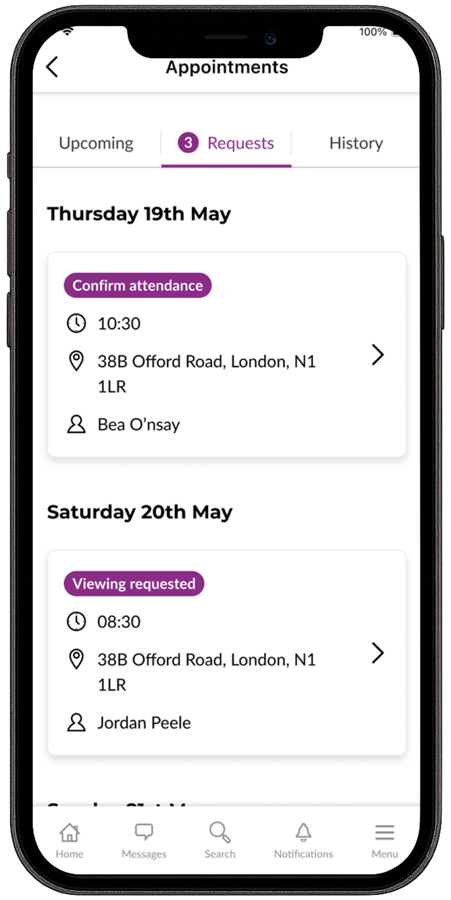
Requests at a glance
Viewings requests a scannable scan list. Requests are now purple and no longer red and looking like an error.
Showing cancelled viewings in history
Based on their feedback users can now view cancelled appointments, bringing parity with the website. Sellers and buyers are able to refer back to past appointments and rebook right from the app.
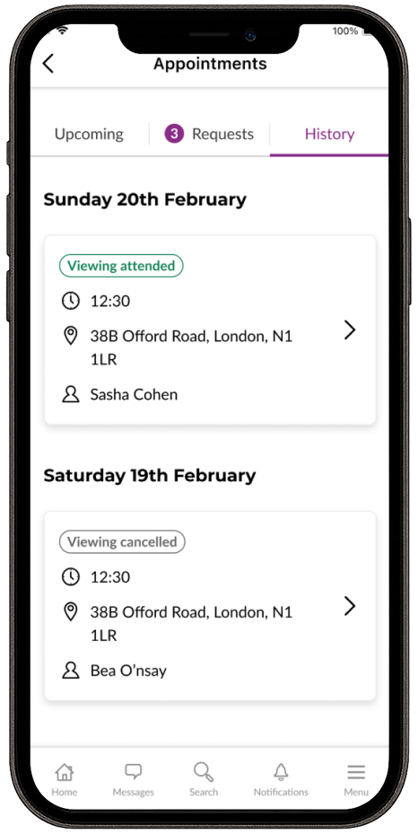
New Purplebricks past and cancelled viewings
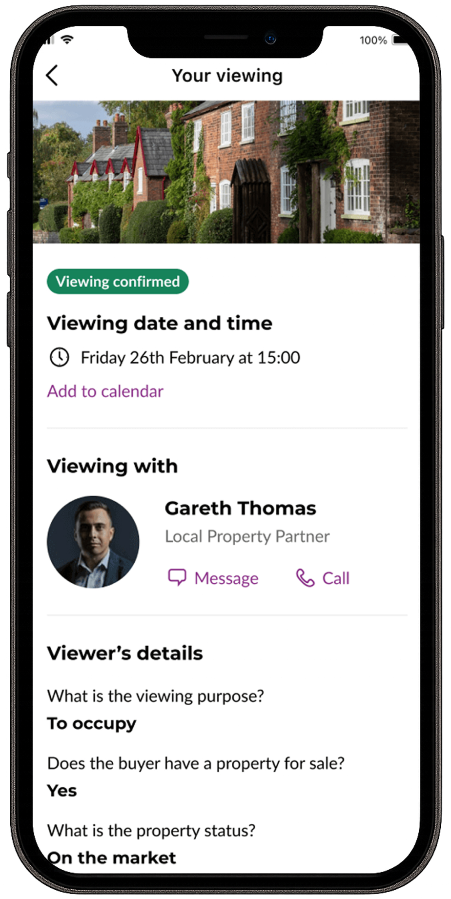
Appointment management from the viewings details page
Using insights from user testing and competitor reviews, we made several fundamental changes to improve clarity and usability:
Surfaced key actions: Important information now appears higher on the screen including options to accept viewings, reschedule requests, and review appointment details.
Optimised image size: Property images were reduced slightly to make room for these key elements at the top.
Refined alerts: Removed the red colour and exclamation icons, which previously created unnecessary urgency.
Improved readability: Increased white space to strengthen information hierarchy.
Unified actions: Introduced consistent button styling, with a clear emphasis on primary actions such as accepting viewings or rescheduling.
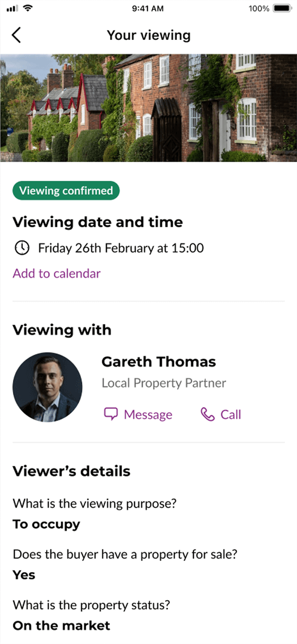
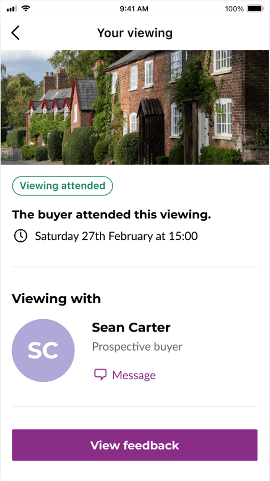
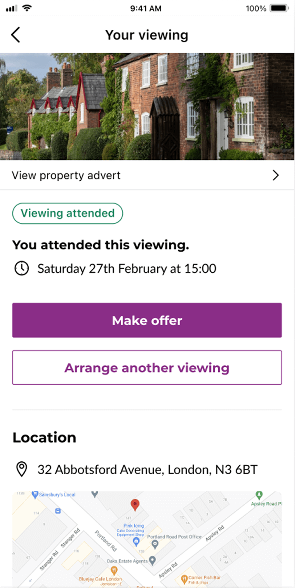
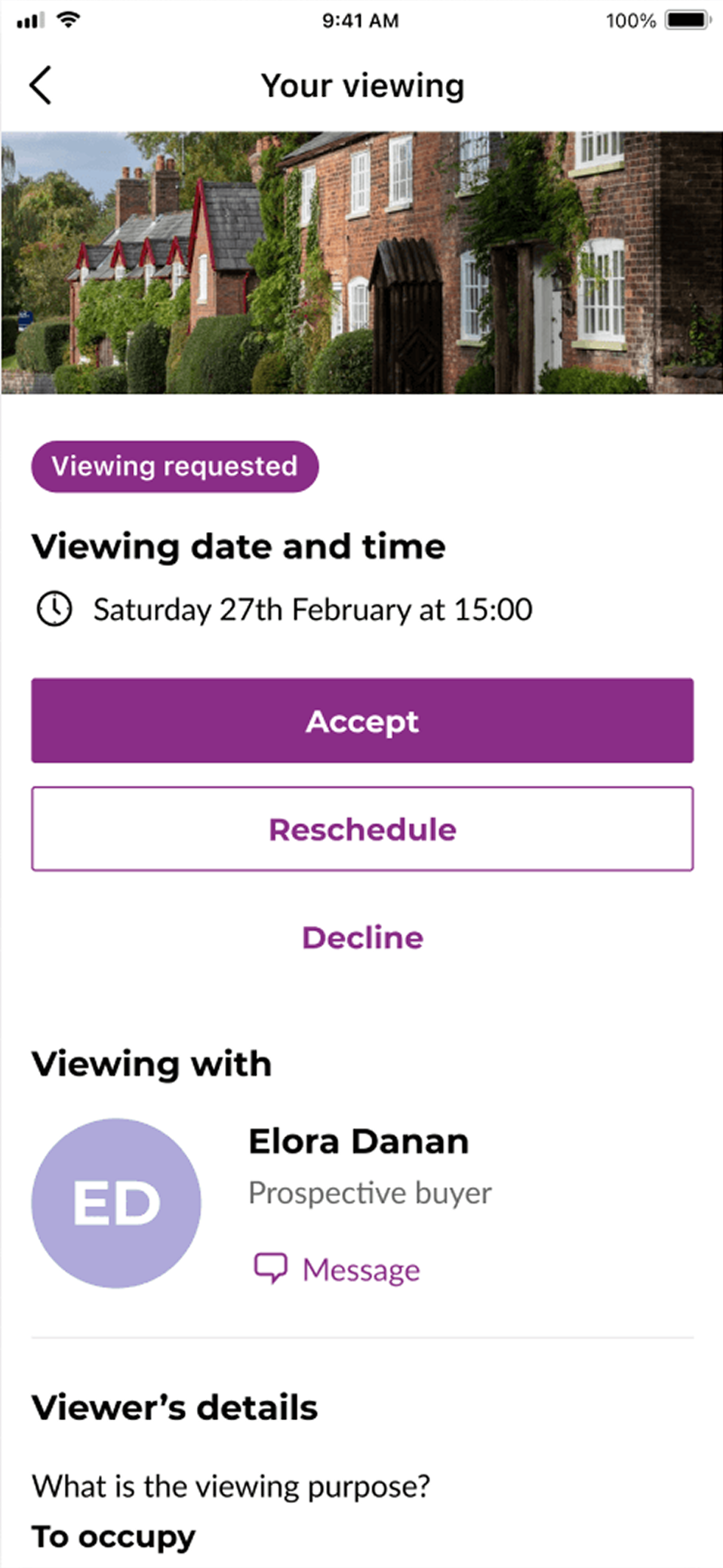
New Purplebricks viewings details page
Delivering the new appointments experience
The new appointments experience was released gradually to manage engineering capacity and mitigate risk.
The project also provided a scalable foundation for future enhancements including push notifications for unconfirmed viewings and deeper integration with the Purplebricks calendar ecosystem.
Impact
- Increased the app store rating of the app from 3.7 to 3.9.
- Number of negative reviews about appointment decreased.
- Accepted viewing saw an increase of 3%
Reflections and learnings
This project reinforced how focusing on clarity and user confidence can have a lasting impact. Even small visual changes helped fix deeper usability problems that were affecting trust in the experience.
If I were to extend the work further, I’d explore adding personalised appointment reminders and calendar integrations, ensuring the system flexes for different user types (buyers, sellers, agents).